Display results
This section describes how to plot the results and list the features available in the plotter.
Plot TimeSeries
After performing a simulation with Cairn, the user can plot the result time series as shown in Fig. 43. The user can switch to the plotter-view by clicking on the Results tab on top of the left-hand side area.
Note
The user can switch back to the plan-view by clicking on the Architecture and Settings tab.
On the plotter-view, the user finds, under Loaded_Results, an item for the result time series corresponding to the last simulation performed (which is automatically loaded). The user also finds an item for every loaded input time series file under Input_TimeSereis. To know how to load an input time series, see Upload the Input time series.
Note
When performing several simulations for different studies/scenarios in the same session, an item for each study/scenario appears under Loaded_Results. Similarly, if a simulation has several solutions, an item appears for every solution.
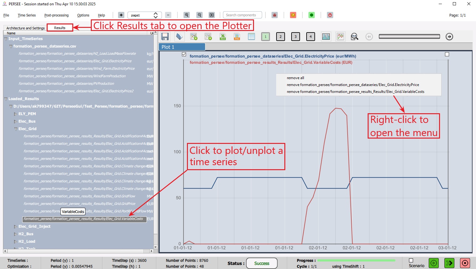
Fig. 43 Plot TimeSeries
The user can plot/unplot a time series by clicking its name in the list. The user can also remove a time series graph or all the graphs by performing a right-click and selecting an item from the menu.
Note
The user can load a result file from a previous simulation, see Load Result TimeSeries.
Plotter Menu
The plotter has a dedicated menu to perform the following actions (from left to right-hand side as shown in Fig. 44 ):
Save a plotter configuration (.xml file)
Open a plotter configuration
Add an f(t)-chart
Add an XY-chart to plot a time series with respect to another time series
Export the plotted time series to a .csv file
Save the current chart as a .png image
Show a table view
The boxes 1 to 4 are used to add/remove the plotter areas. Each area allows to plot up to 8 time series. Area 1 is enabled by default. The color of the box is green when the area is enabled and gray when it is disbaled.
Switch to fill mode, that is, to fill the area under the graph
Switch to dot mode, that is, to display the dots on the graph
Change the display range (time-axis range), e.g., Day, Week, Month, Full.
A slider to shift the view when the entire range is not displayed.
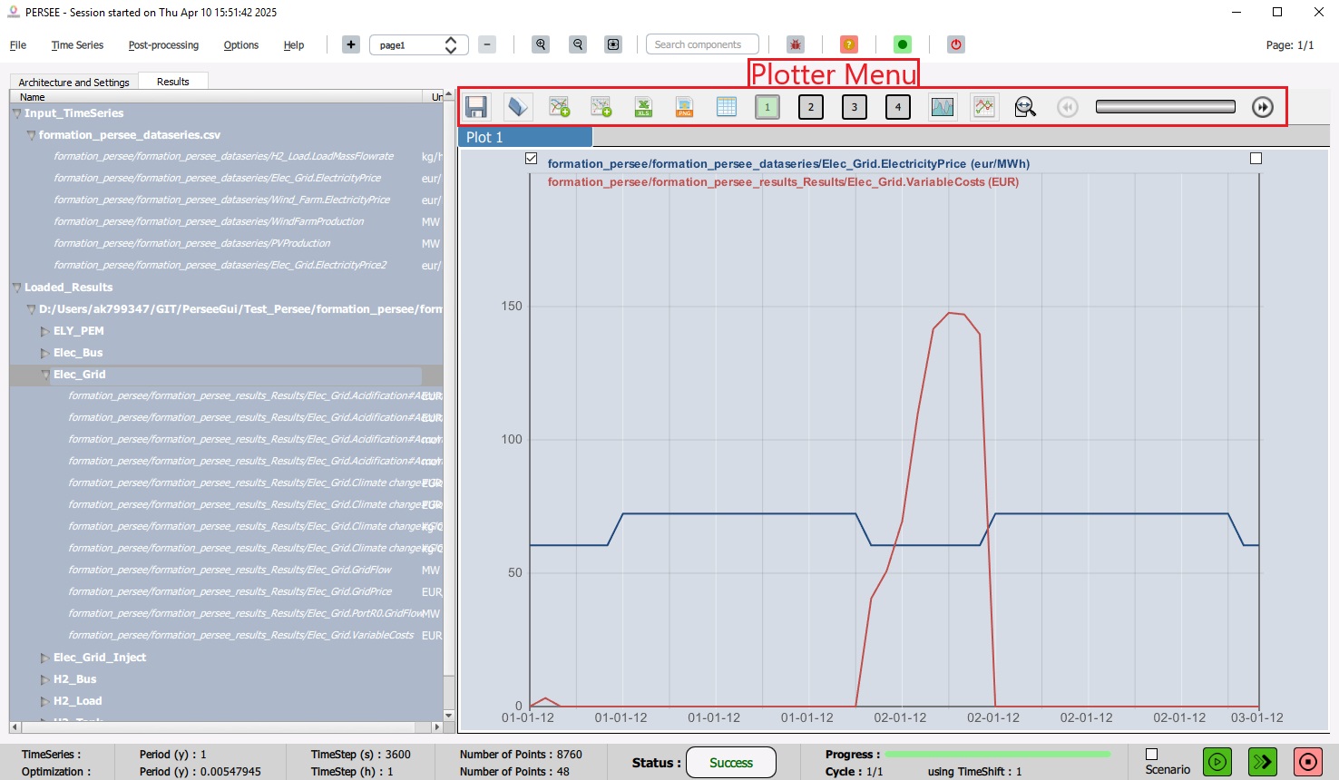
Fig. 44 Plotter Menu
Load Result TimeSeries
The user can load the result file from a previous simulation by opening the “Time Series” menu from the Toolbar then clicking “Load Result Time Series” item as shown in Fig. 45. This allows the comparison of results from different studies/scenarios by plotting them on the same graph.
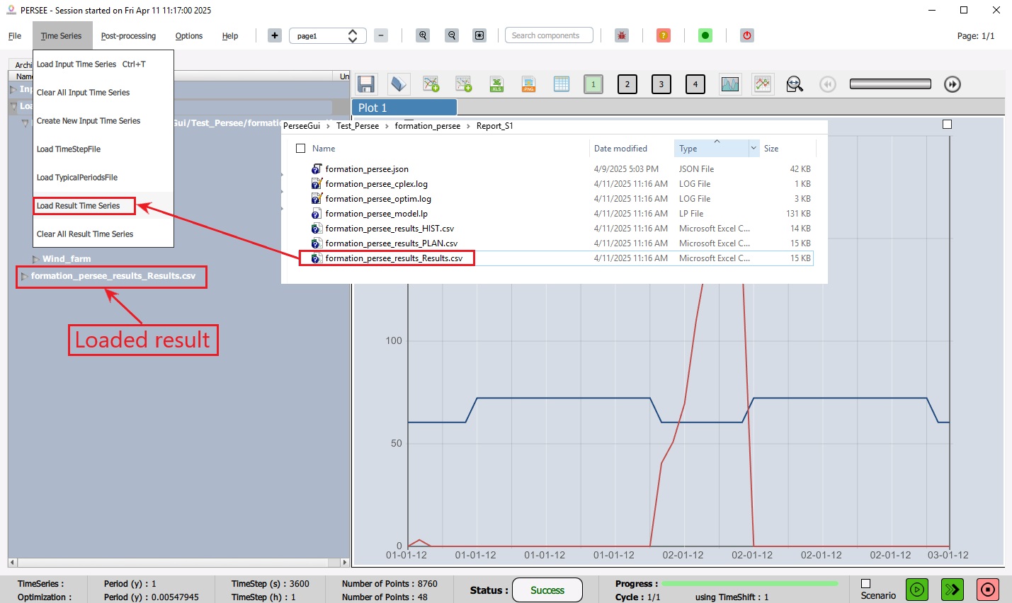
Fig. 45 Load Result TimeSeries
Once a result file is uploaded, a corresponding item will appear on the Results tab under Loaded_Results. The related time series can then be plotted as described in Plot TimeSeries.